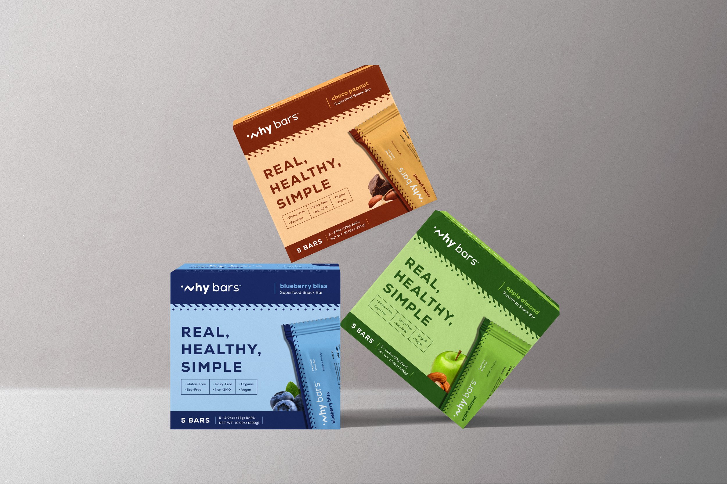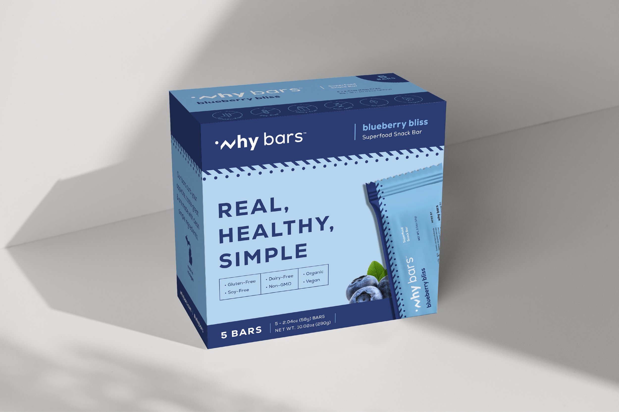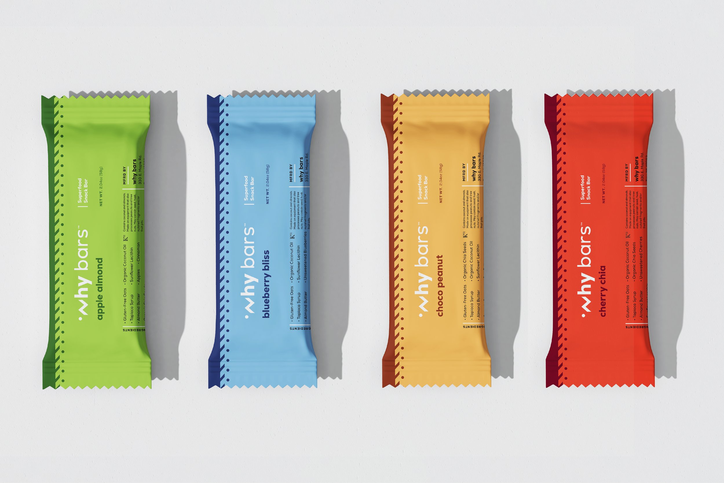
Why Bars is a superfood snack bar that is made with simple, clean ingredients that will curb your appetite and leave you feeling energized. Its mission is to provide those living an active lifestyle with a portable food option that not only tastes great but also sustains your energy level between meals allowing you to focus on your activity instead of your hunger.
The Ask: To develop a refined identity that preserved the original Why Bars vision while elevating its appeal to resonate with its niche audience and compete in the snack bar space.
Services: Visual Brand Identity, Brand Strategy, Print Collateral, Social Graphics, Packaging, Store Displays
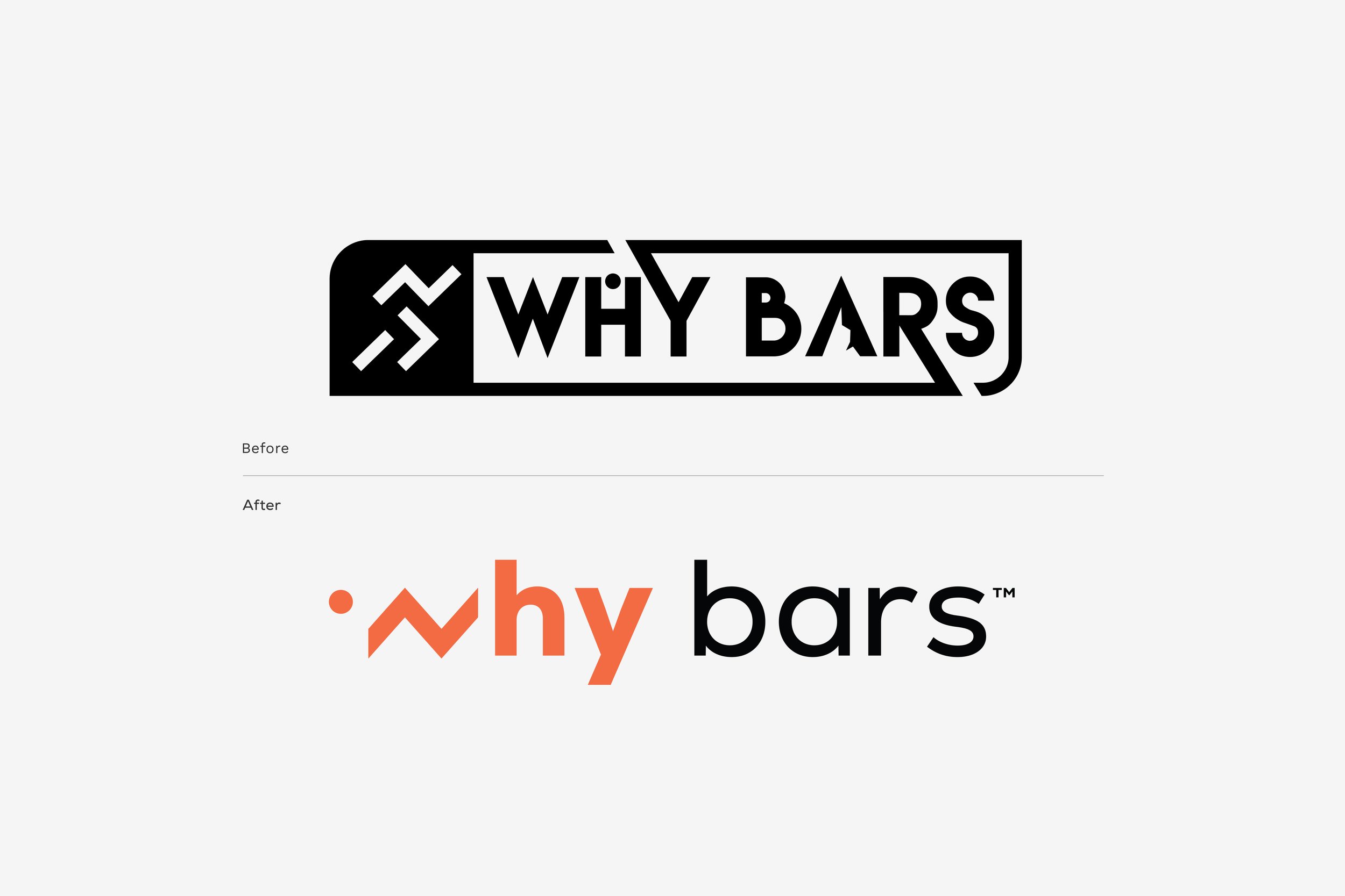
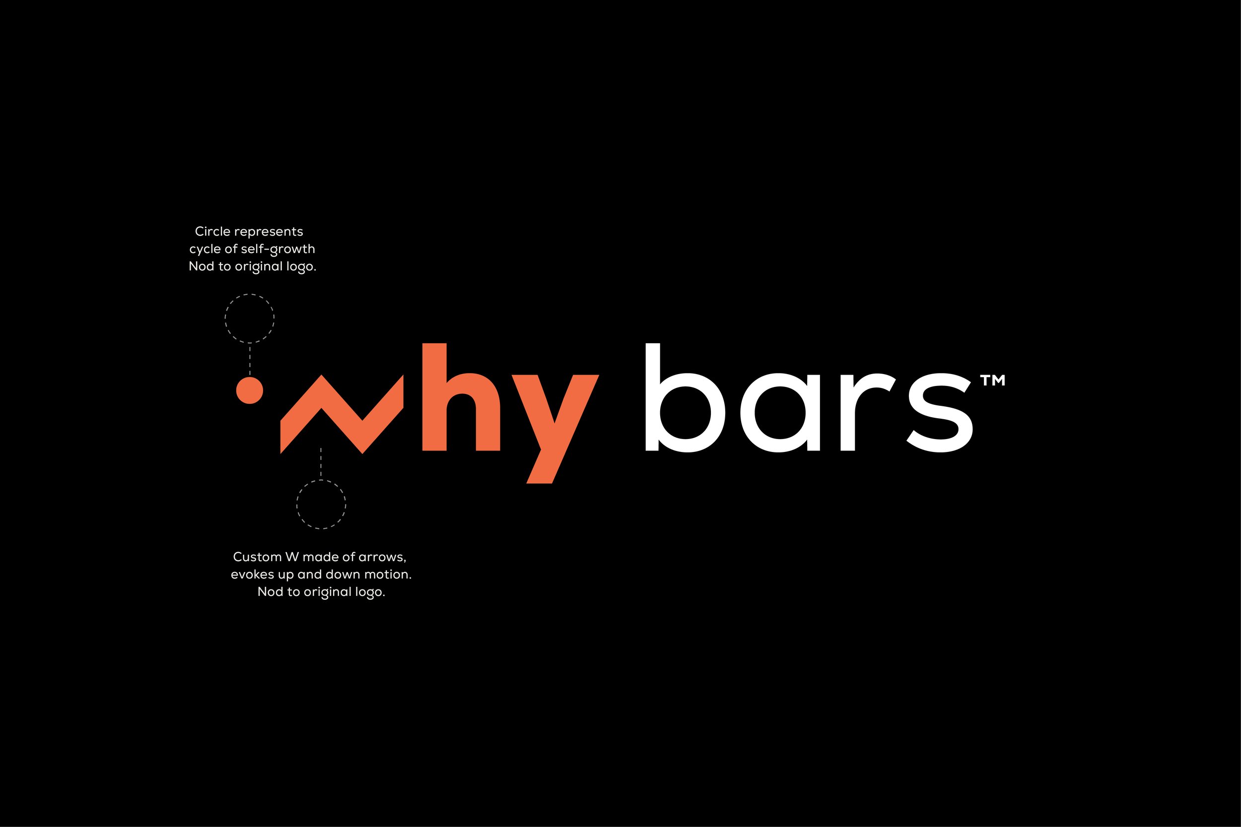
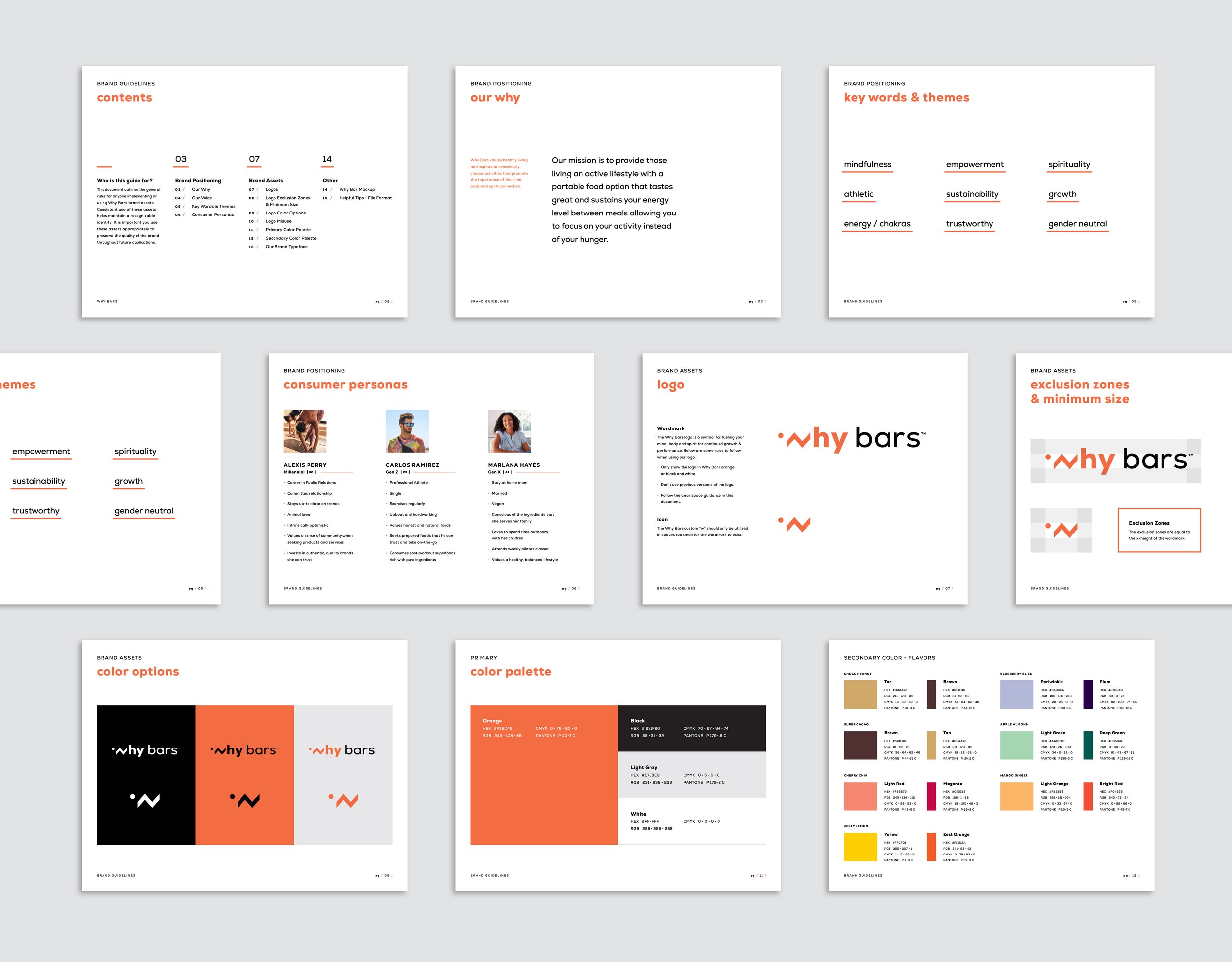
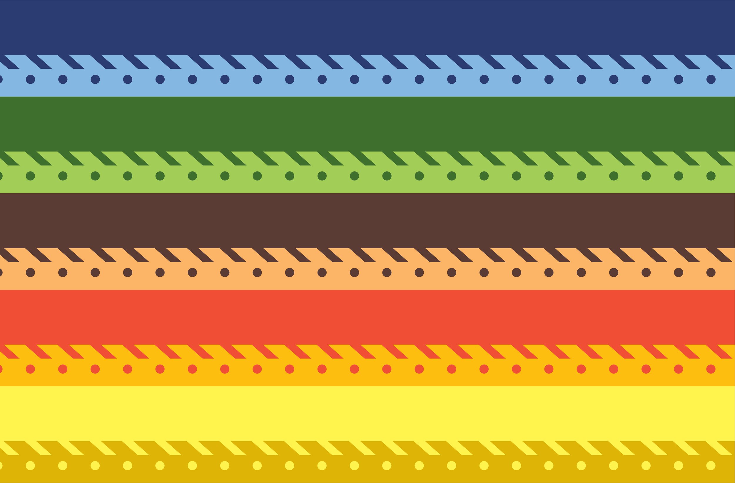
Design Solution: The custom “w” represents motion with the up and down arrows that come together. The circle in the “w” nods to the continuous cycle of self-growth, both of these elements are refined pieces of what was used in the original logo but in a new way. The primary color, orange feels active while also being gender-neutral in style. The secondary color palette is specific to each bar flavor and includes two contrasting tones. Using the custom “w” we created a pattern element that can be found on the packaging and other brand collateral.
Phase 1 (Identity +) / Creative Team: Alicia Cox/Palazzolo, Alex Jona, Genevieve Maiani, Rylie Butner
Boxes / Creative Team: Design- Alicia Cox Designs, Copy/Strategy- Alex Jona (Brand Barr)